 Datapolis
Workflow Designer
Datapolis Workflow Designer is a tool for creating workflows, where you can set up the whole process, along with a number of various conditions, permissions, automated tasks and other elements. Then you can deploy it on your list, where it will be run.
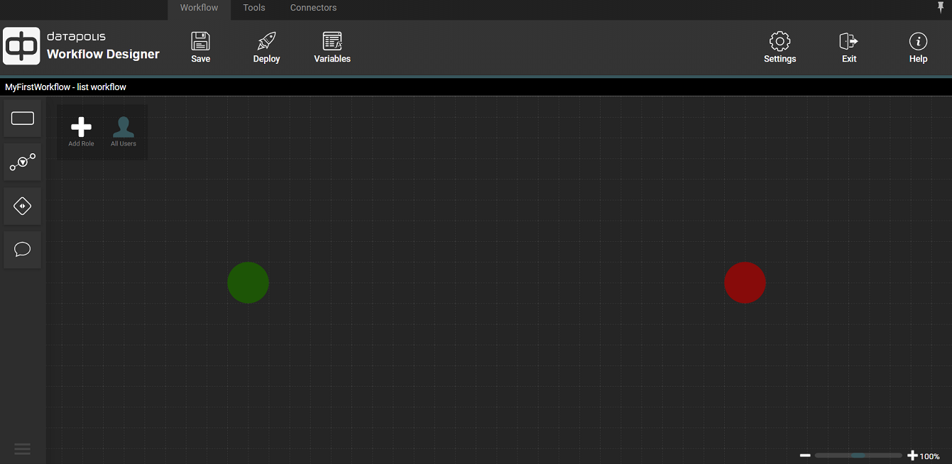
Each process has to start and end somewhere - these are the entry points and exit points, respectively. They are represented as a green (start) and red (end) circles on the diagram. Other workflow elements are: states, actions (transition from state to state), activities (operations which are to be performed by the system when making a transition between states) and permissions.
When entering Datapolis Workflow Designer for the first time, you see a plane with a starting and ending points of the process.
Ribbon
On top of designer there are three menus in ribbon:
- Workflow
- Tools
- Connectors
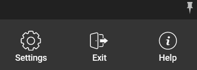
In addition, there are buttons in the right corner of the screen:
- Settings
- Exit
- Help
- Pushpin button
Workflow

This menu contains below buttons:
- Save - save your workflow definition draft
- Deploy - deploys workflow to list
- Variables - window that allows to add and configure workflow variables
Tools

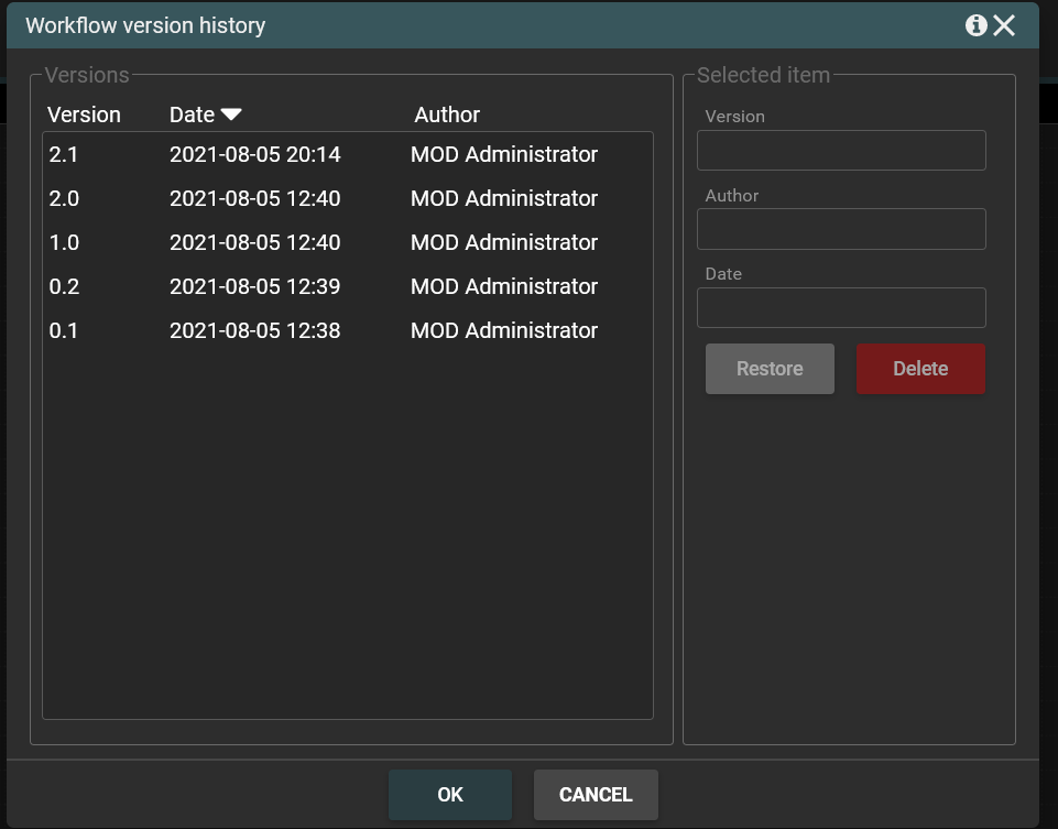
The menu contains History button. When you click the History button you will see a list of all workflow versions. You can replace the current workflow definition with an earlier version. To do this, select workflow version and click the Restore button. To confirm the operation click OK button in the modal window. Then the designer will display the selected version of the workflow.
You can also delete selected versions of the workflow. To do this, choose workflow version and click the Delete button. To confirm operation you have to click OK button in the modal window. The version of workflow will be deleted.
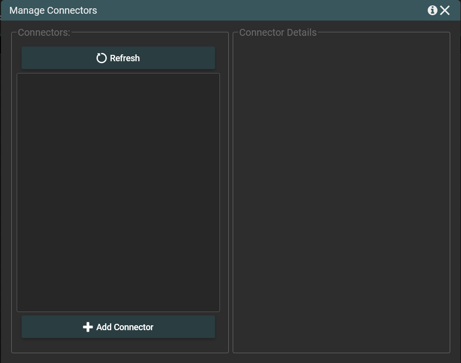
Connectors

The menu contains Manage Connectors button. When you click Manage Connector button the window for managing connectors will be displayed.
Menu in the right corner
- Settings - popup containing workflow settings e.g. methods of workflow start.
- Exit - opens a modal window to confirm the designer closing operation.
- Help - opens information window. The window contains information about the application version, about the possibility of getting help, the so-called support inquires and the name of the current user. The window has a link to the support page and link with email.
- Pushpin button - hides ribbon.
Toolbox
On the left side of the screen there is also a toolbox with a set of workflow objects that you can drag and drop to you workflow. The toolbox looks like this.

The icons in turn mark:
In the lower left corner there is a three-line icon. If you want to close the toolbox, click on the three-line icon. The icon looks like this.

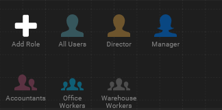
Roles
In the top-left corner of the screen is a role toolbar, where you can define new roles to be used in the process and manage the existing ones.
Zoom
On the bottom-right side there is a slide which allows zoom-in and zoom-out entire diagram.
